
Features
WPStylo covers every layer of your visual identity - from color scales to responsive typography - in a single, visual workspace.
No code required.
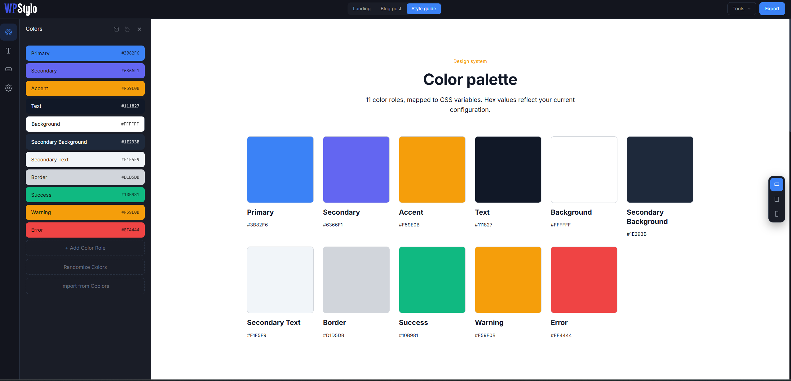
Colors
A color system that actually makes sense.
Stop picking colors blind. WPStylo gives you a semantic color system built around roles, not random hex codes.
Semantic roles
Assign a purpose to each color: Primary, Secondary, Accent, Text, Background, Border, Success, Warning, Error. Every export uses those role names, so your CSS stays readable and your builder settings stay organized.
Automatic shade scales
Pick a base color. WPStylo generates the full 50→950 shade scale automatically so you always have a light tint and a dark shade ready, without opening another tool.
WCAG contrast checker
The contrast ratio between any text/background pair is calculated live, with AA and AAA compliance displayed in real time. Accessible design, built in not bolted on.
NEW
Import from Coolors
Already have a palette? Import it directly from a Coolors URL and map it to your roles.
NEW
Randomize colors
Generate a fresh semantic palette in one click, accessible by design (WCAG-checked), not random hex.
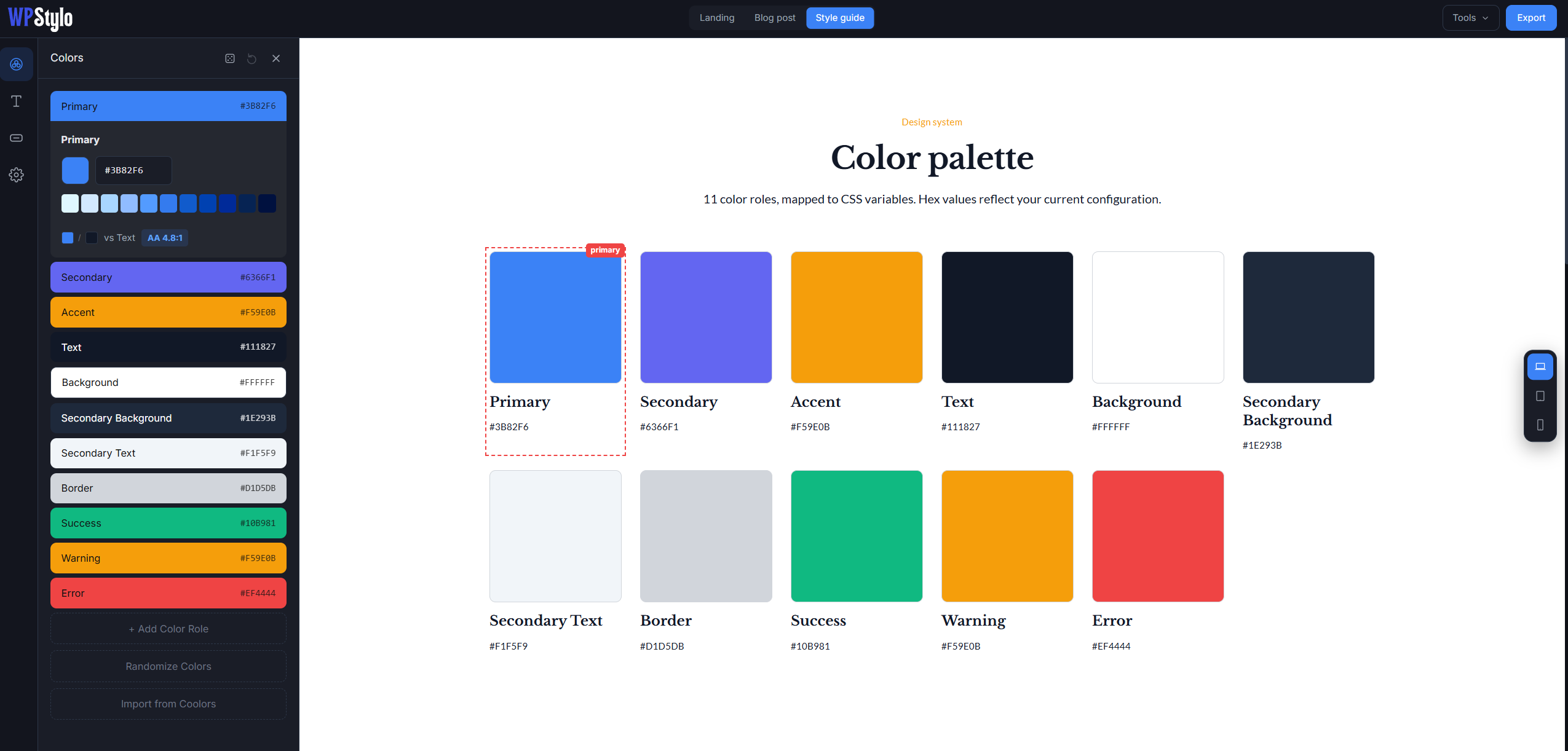
Typography
Responsive typography,
done right.
Role-based typography
Assign fonts to specific roles: H1 through H6, Body, Small, Caption, Button, Nav. Every role has its own font family, weight, letter-spacing and line-height.
Google Fonts sync
Search and load any Google Font directly in the app. The preview updates instantly, you see the font in context on your dummy page, before committing.
Set your desktop size and mobile size. WPStylo calculates the clamp() function automatically (min, preferred value, and max) calibrated to your breakpoints. No more manual math.
NEW
Randomize fonts
One click swaps in a curated, readable font pairing across your heading and body roles.
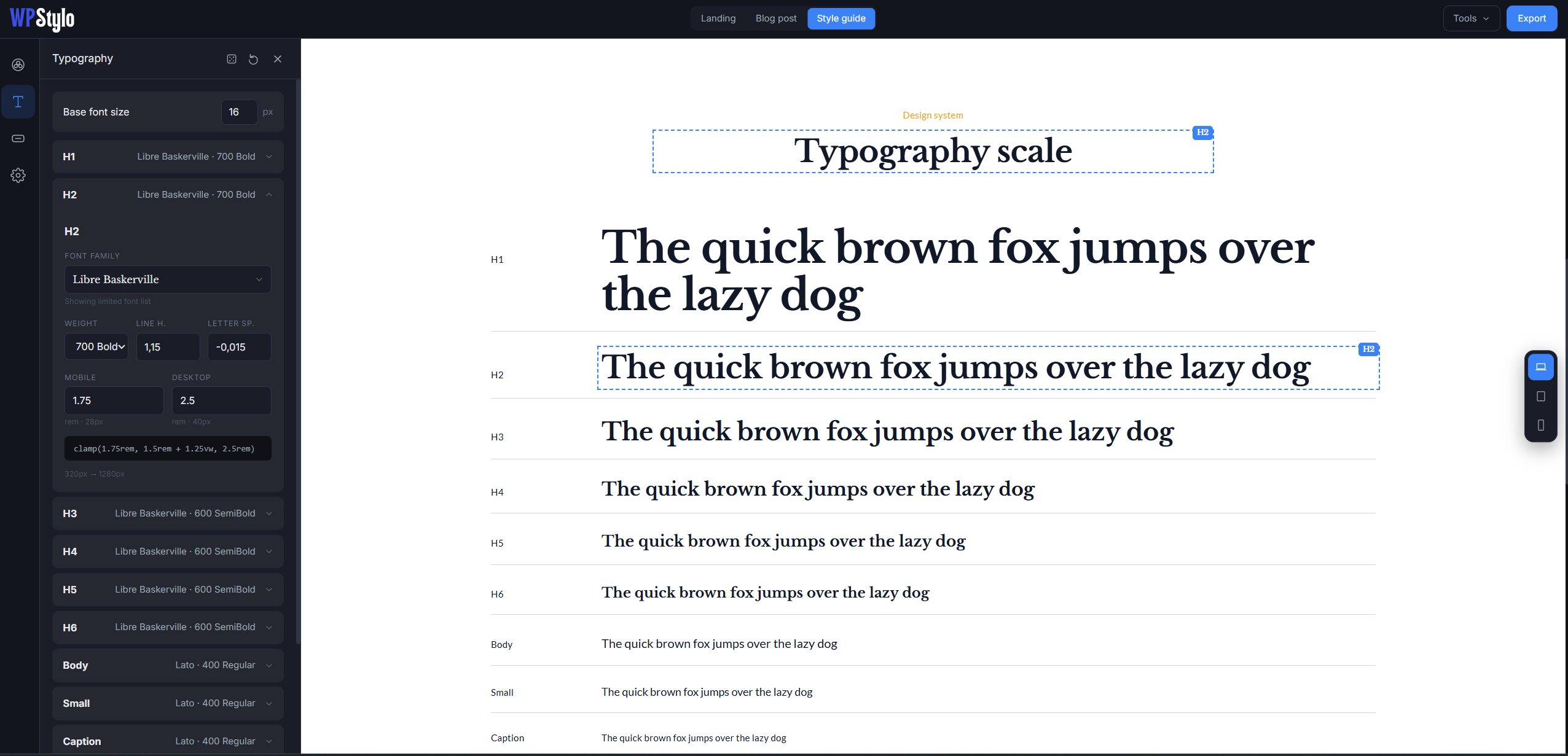
Buttons
Every button state, previewed live.
Configure all five button variants in one place and see every hover, focus and disabled state update in real time on the preview canvas.
5 variants
Primary, Secondary, Outline, Ghost and Link: the five button types you actually use on every project.
4 states per variant
Default, hover, focus and disabled. Each state has its own background, text color and border, configured independently.
Per-variant control
Border-radius, horizontal and vertical padding, font size, all configurable per variant. Make your Ghost button rounder than your Primary if that's what the design calls for.
Button text scales responsively too. Set a desktop and mobile font size, WPStylo generates the clamp() like it does for headings.
Elements
Consistent details across the board.
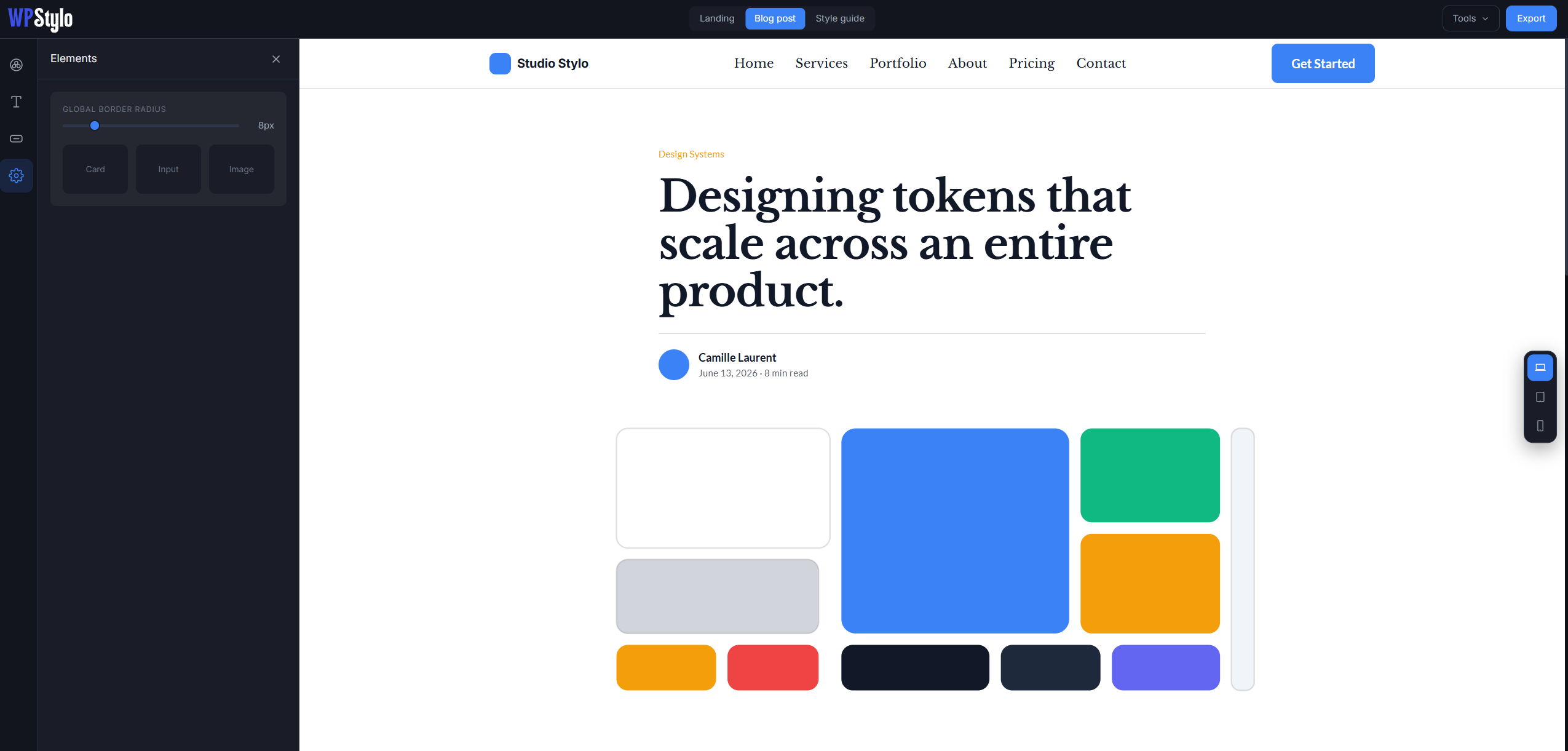
Global border radius
Set one value for all cards, images and inputs. Or override it per component: the choice is yours.
NEW
Default transitions
Set a default transition duration and easing curve. Applied to all hover states in the export so your buttons and links feel consistent without writing CSS manually.
New
Scroll appearance effects
Choose a global on-scroll animation preset for your whole design system: Fade Up, Fade In, Slide Left, Slide Right, or Zoom In (or None to turn it off). See it play live in the preview as you scroll, with a Replay button to watch it again on demand. It’s applied on your live site by the companion plugin.
(Coming soon)
Shadow presets
Choose from five presets (none, sm, md, lg, xl) or define your own custom shadow. Applied to cards in the live preview so you can see the effect before exporting.
(Coming soon)
Spacing scale
Define a base unit, WPStylo generates the full spacing scale (4, 8, 12, 16, 24, 32, 48, 64…) automatically. Exported as CSS custom properties for easy use in your theme.
Live preview
See the full picture, before touching WordPress.
The right side of WPStylo is a full dummy page that uses your design tokens in real time. Not a color swatch. Not a sample button. An actual page layout.
Hero section
Heading (H1), subheading, body text, CTA button and an image placeholder.
Features & cards
3 cards with icon, heading (H3) and body text, all using your tokens.
Form
Input fields, textarea, select, checkbox and submit button: real states, live colors.
Testimonial & footer
Quote, avatar, name, plus a footer with link columns and nav text.
Viewport switch
Desktop, tablet and mobile: switch with one click. Responsive font sizes scale proportionally.
Blog page
A full article layout, H1–H6, body, links, blockquote, captions. The best stress-test for your typography.
Style guide
A dedicated view of your palette, type scale and button variants - separate from the demo pages.
View switch
Flip between Landing, Blog and Style guide in one click.
More to come !
Extra templates and new features on the way.
Portability
Your design system travels with you.
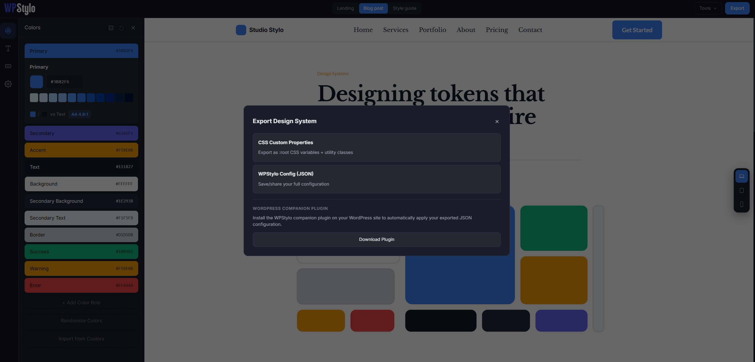
WPStylo JSON
Save your full configuration as a .json file. Every color, font, button and element: all in one portable file. Import it on any project, on any machine.
Share with clients
Send your config JSON to a client or collaborator. They import it in their own WPStylo instance and see the same live preview. A simple, codeless way to validate a visual direction before development.
Multi-format export
One config → CSS Custom Properties, Elementor Kit and theme.json. Switch formats any time without re-configuring anything.